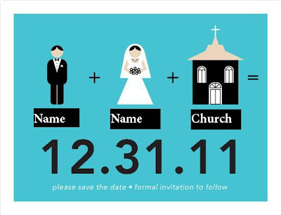
And OH MY GOODNESS are they awesome. I am SO happy with our choice. My MOH G saw the package before I did and I've been told she said "Wow, this is definitely a "Mishka and Ang" Save The Date." And she's right. It's whimsical and very cute, but it's also relatively simple and understated. In a word, it's perfect.
But you don't get to the perfect Save the Date after one try. In fact, we went through a number of Save the Date drafts before we finally came up with our final version. So let's take a walk down save the date memory lane shall we?
This first version is one I threw together on picnik.com before we were even engaged. It was back in the days when Mishka and I knew we were getting married, but we hadn't been able to get engaged yet. It doesn't even say Save the Date or any information so we moved on quite quickly. But Mishka really loved my little design so I thought I'd share it:
This second one was also made on picnik.com, but I made it in the actual format of a Save the Date. In fact, Picnik has templates for Save the Dates. I found them on Google Weddings. For awhile I thought this format was going to be our official Save the Date, but once we did a bit more in-depth searching we realized there was some better stuff out there. But to share our second picnik draft with you... here you go!
We eventually found a site where we felt the save the dates were both beautiful and affordable. Weddingpaperdivas.com. At first we really liked the idea of having a Save the Date with out pictures on it. We picked our favorite one, personalized it to fit our names, date, and supply a bit of information on the back. But...no matter how pretty it was, or how wonderful the picture selections, we both knew it wasn't "the one" (yup, "the one" can be used to talk about anything):
And, after realizing that there were some legitimate issues with the previous design, we moved on to what ended up being "the Save-The-Date". We had both thought it was really cute when we were first perusing the site, but it had seemed really important that we have our faces on the save the date. Turns out that was not at all a necessity and I am so happy we got through that "needs our pictures" phase. Because I truly could not be happier with our final product!
Aren't they cute? Obviously "name" "name" and "church" are replaced with the actual things. And there aren't those ugly black boxes... I just am not that talented at paint.


No comments:
Post a Comment